
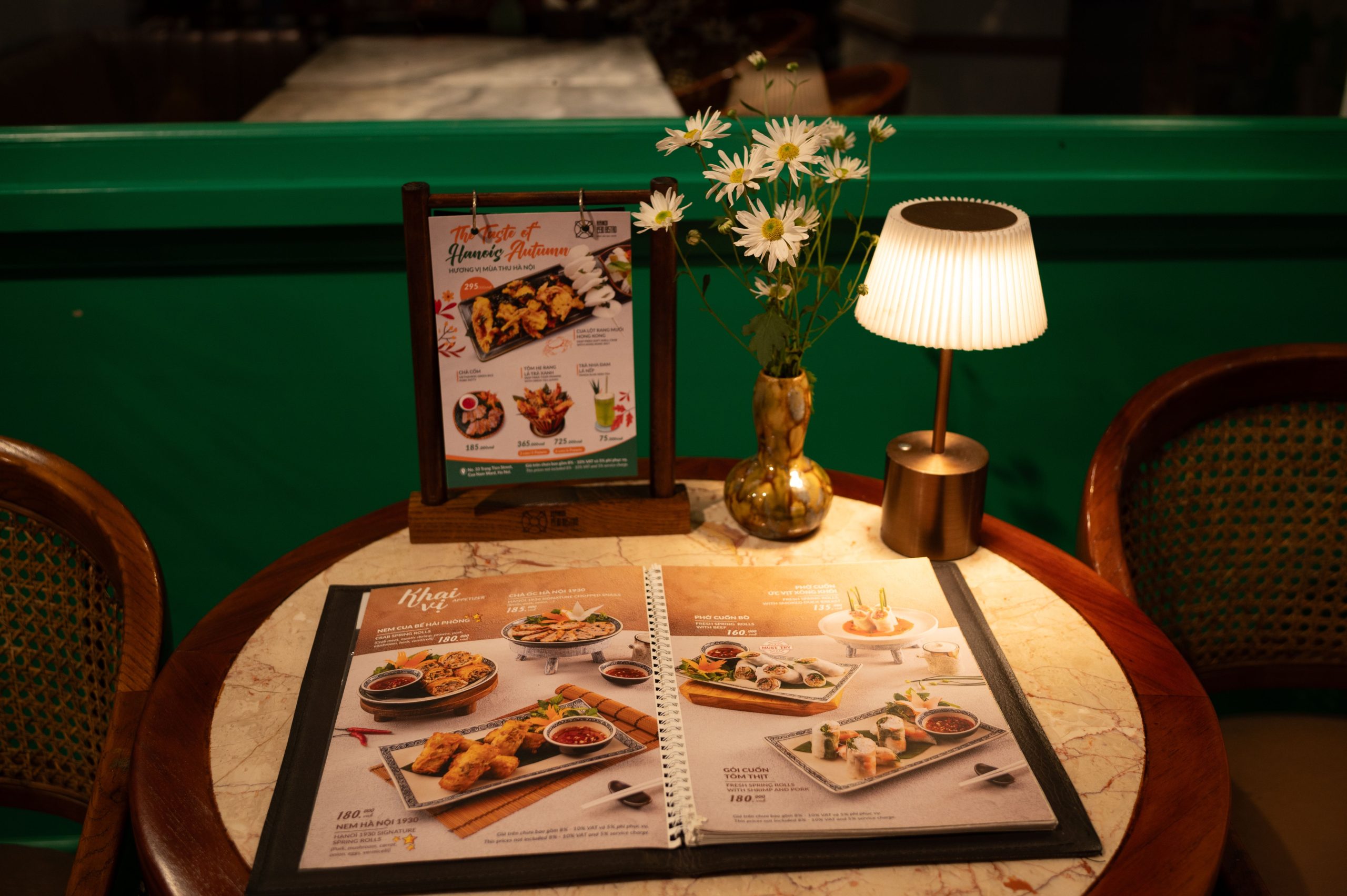
A menu does not merely describe dinner. Before a guest has tasted anything, its colors have already suggested whether the meal will be fresh, spicy, indulgent, homemade, modern, or faintly suspicious.
That makes a well-chosen menu maker more than a layout shortcut. It is a way to control the visual cue that arrives before the food. Warm reds, oranges, yellows, terracotta, and toasted browns can make a dish feel more immediate and generous, but only when they agree with the food rather than shouting over it.
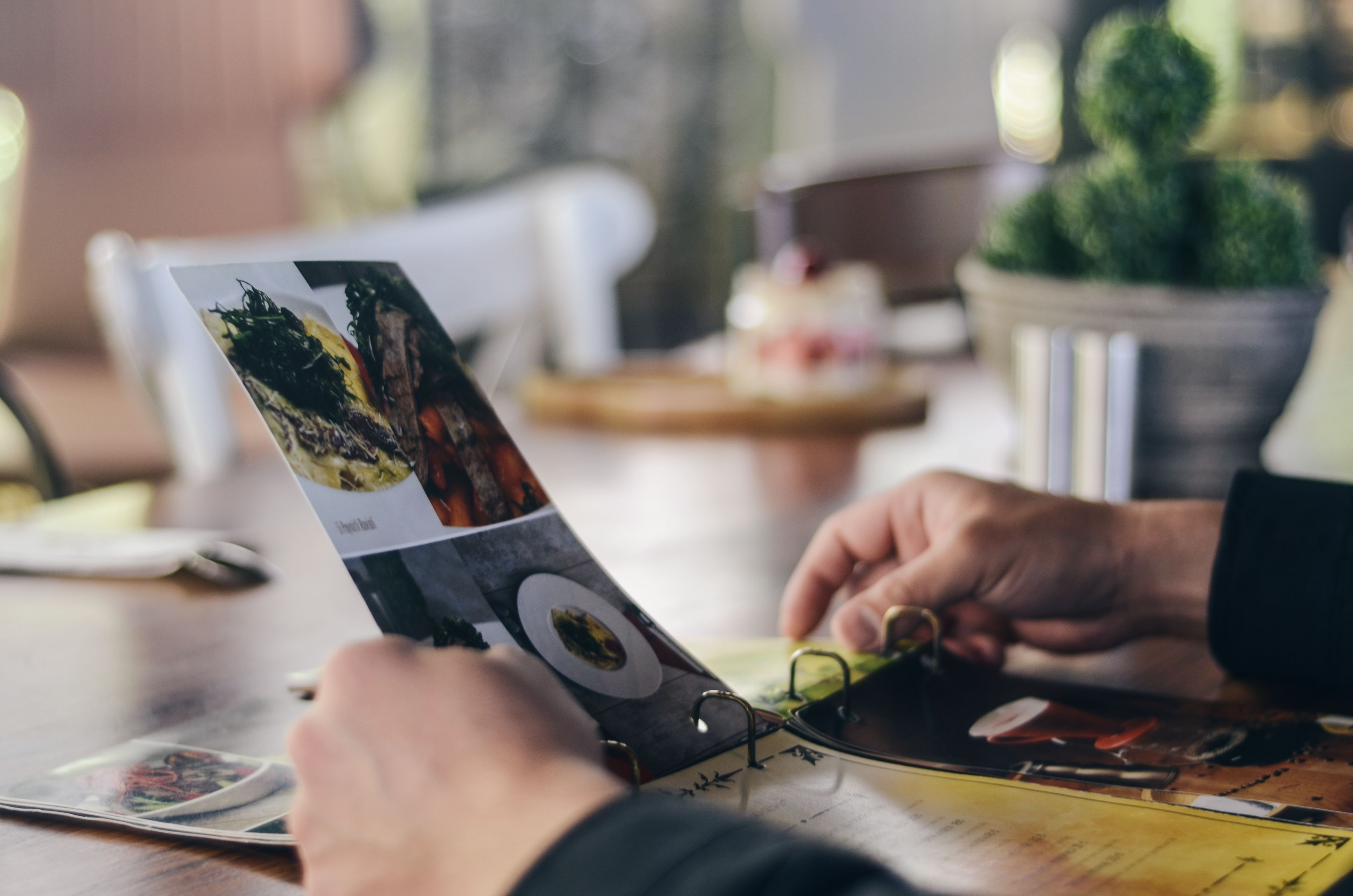
Warm colors do not “create” flavor. They prime it.
The cleanest explanation is expectation. People see a red tomato sauce and anticipate acidity, sweetness, and heat. Orange suggests citrus, caramelization, roasted vegetables, or spice. Golden yellow can imply crispness, butter, warmth, or freshness. By the time the fork arrives, the brain is not starting from zero.
A 2019 review by psychologist Charles Spence found that food and drink color often influences multisensory flavor perception, while also stressing that results are mixed and highly dependent on context. Color is especially reliable at helping people identify what a food is supposed to taste like; it is less reliable as a universal volume knob for “more delicious.”
That distinction matters for menu design. A warm palette should make the promise clearer, not make an ordinary dish look artificially intense. If the menu shows a scarlet visual language but the dish arrives pale and delicate, the gap between expectation and experience can work against the restaurant.
Why red, orange, and yellow feel food-friendly
Warm hues have several advantages in a food setting:
- They are visually assertive. Red and orange tend to pull attention forward, which helps a featured dish or limited-time special stand out.
- They resemble familiar food cues. Ripeness, browning, roasting, fruit, spice, and cooked sauces all supply learned associations.
- They can imply energy. A warm accent often makes a menu feel livelier and more informal than a cool blue or gray system.
- They pair well with neutrals. Cream, charcoal, paper white, and dark brown give warm food photography somewhere to breathe.
There is also a deeper visual shortcut at work. In a 2016 Scientific Reports study of food images, red brightness predicted greater reported arousal, while greener brightness predicted lower arousal and lower perceived calorie content. The finding does not mean that red food is objectively higher in calories. It suggests that viewers use color as a quick, imperfect heuristic when evaluating food.
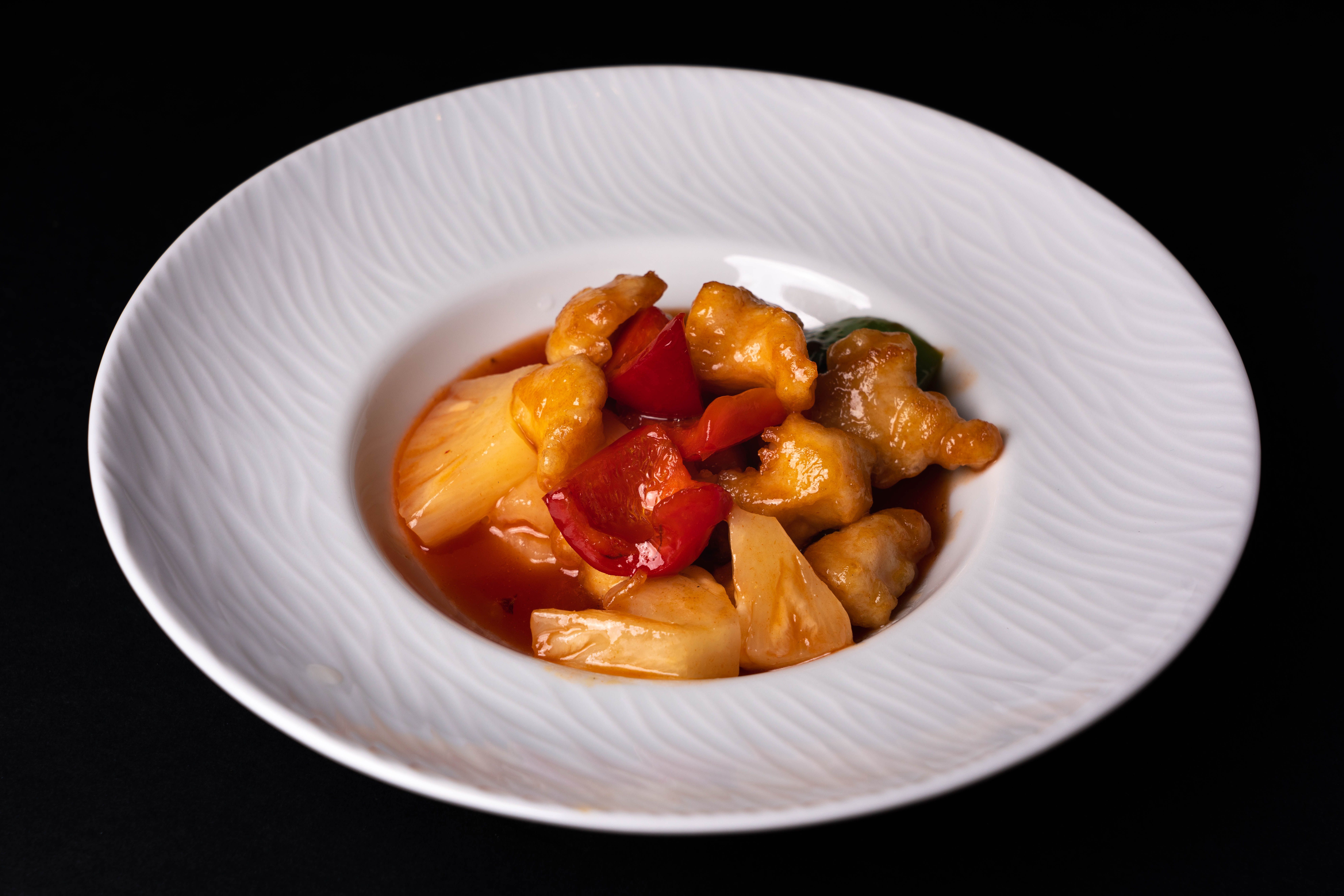
The flavor effect is strongest when the color makes sense
Color psychology is not magic, and it is not a license to tint everything orange. The more familiar the color-flavor pairing, the more likely the cue is to help.
A systematic review published in 2023 examined 52 studies of visual cues and taste or flavor perception. Its conclusion was nuanced: color and other visual features can influence expectations and, under some conditions, the tasting experience, but the evidence for changing perceived intensity is mixed. The review also highlights the importance of congruence. A color that points toward a plausible flavor can assist the experience; a color that contradicts it can create confusion or disappointment.
That gives restaurant designers a practical rule: use warmth to clarify a dish’s character, not to disguise its character. Chili oil can support red. Citrus can support orange and yellow. A rustic braise can support clay, copper, and browned neutrals. A cucumber, herb, or seafood dish may need cool greens and blue-grays even if the overall brand uses warm accents.
Warm palette does not mean red background everywhere
This is where many menu designs go wrong. They treat the entire page as an appetite trigger and fill it with saturated red. The result is often visual fatigue, poor text contrast, and a menu that feels like a warning sign rather than a meal.
Think in layers instead:
- Base: warm white, pale cream, kraft, stone, or a restrained charcoal.
- Primary accent: one warm hue that carries the restaurant’s personality.
- Food cue: the natural reds, oranges, yellows, and browns already present in the photography or illustrations.
- Contrast color: a muted green, blue, or dark neutral used sparingly to separate sections and prevent monotony.
In my view, the best food menus rarely look “colorful” in the loud sense. They look edible. That usually means a controlled palette with enough warmth to suggest pleasure and enough negative space to make the actual food do the persuading.
What the research says about plates, backgrounds, and contrast
The color of the food is only one part of the scene. Plate color, background, lighting, and the contrast between the dish and its surroundings all alter what a diner expects.
A 2017 study of hot soup compared identical soup colored white, yellow, or blue. The blue version received substantially lower ratings for willingness to eat, palatability, comfort, and warmth than the white and yellow versions. The sample was small, just 12 young women, so it is evidence of a specific effect rather than a universal law. Still, it captures something designers recognize intuitively: a visual cue can change the emotional temperature of a dish.
Plate research is less tidy. In a 2018 randomized crossover trial with 54 women, participants consumed more energy from red and black plates than from white plates during a pasta lunch. Other experiments have found the opposite pattern for red receptacles. The likely lesson is not “red plates increase appetite” or “red plates suppress it.” It is that color interacts with food type, contrast, perceived healthiness, and the meaning people attach to the color.
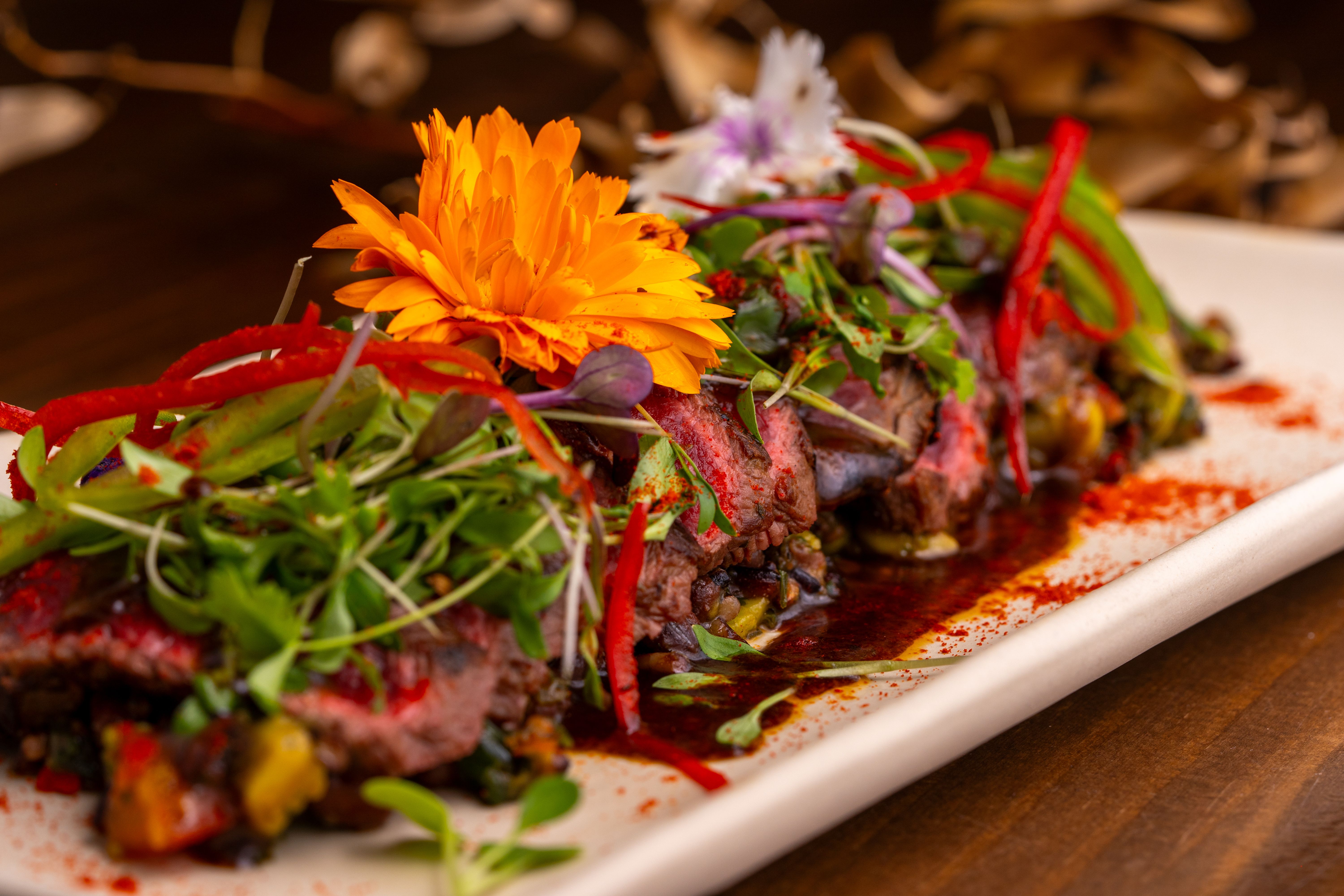
Use saturation like seasoning
Hue gets the attention, but saturation often determines whether a menu feels appetizing or synthetic.
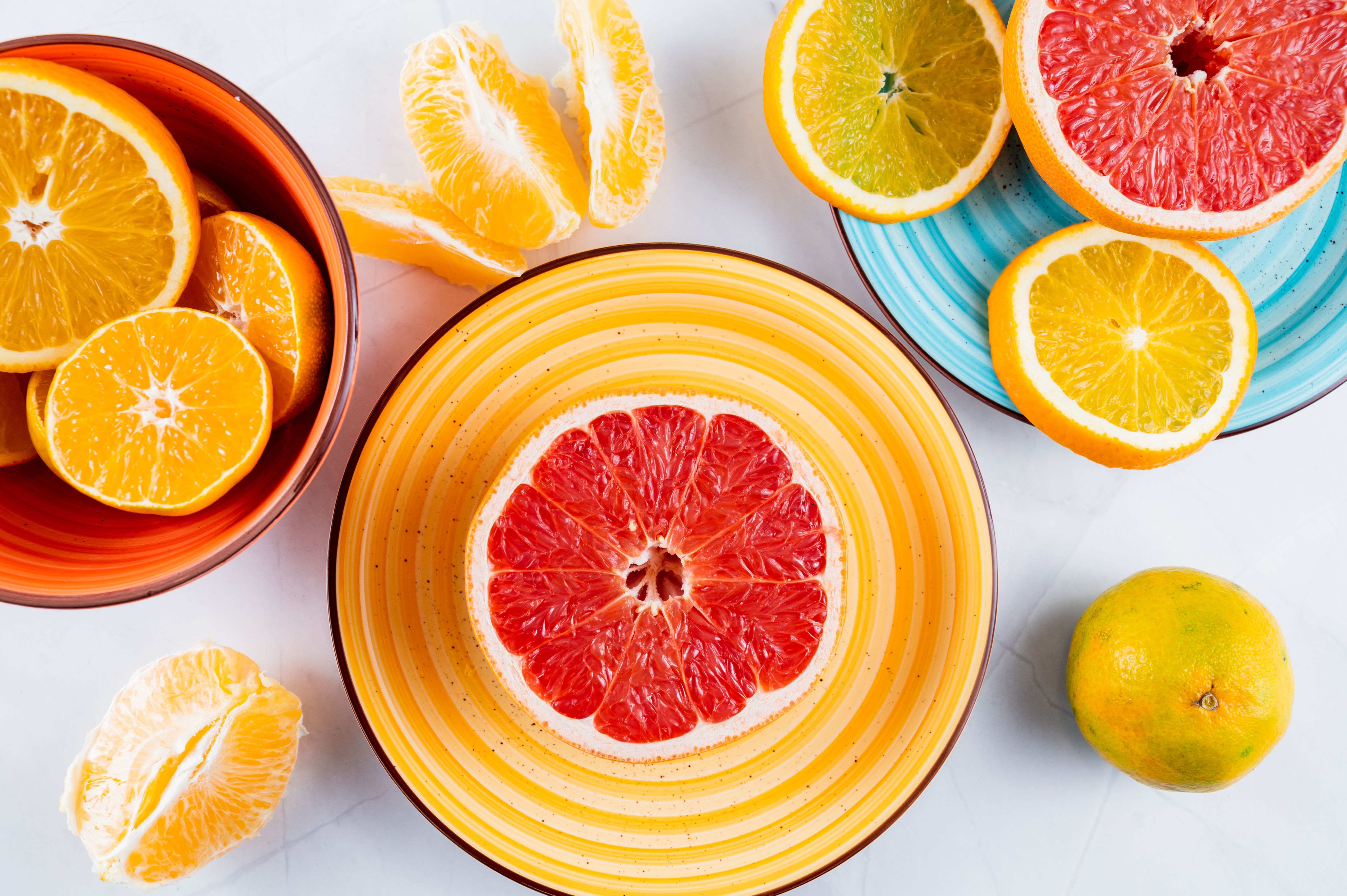
High-saturation red can signal heat, urgency, or fast casual energy. It may suit a burger bar, barbecue restaurant, or takeaway brand. The same red can feel aggressive around a tasting menu or a quiet wine list. Lowering saturation toward paprika, rust, terracotta, or burnt orange preserves warmth while adding maturity.
Lightness matters too. A pale apricot can suggest freshness and brunch; deep burgundy can suggest richness and evening dining. Dark brown can make a menu feel grounded, but too much can absorb detail in food photography. The goal is not to find the universally most appetizing color. It is to match the visual temperature to the price, pace, cuisine, and occasion.
Four menu decisions that make warm palettes work
1. Give the hero dish the warmest contrast
If every item is equally vivid, nothing is featured. Use the strongest warm accent around the dish you most want noticed, then quiet the surrounding items with neutral typography and spacing.
2. Match color to the promise in the copy
Words such as “smoky,” “roasted,” “zesty,” “crispy,” and “spiced” can be reinforced by warm visual cues. A dish described as “cool,” “briny,” “herbal,” or “delicate” may need a cooler counterpoint. The copy and color should tell the same story.
3. Check the dish at thumbnail size
Menus are increasingly viewed on phones, social feeds, digital boards, and delivery platforms. Shrink the design until the food image is small. If the warm accent disappears, it is too weak; if the entire image becomes a red-orange block, it is too strong.
4. Test the real print, not only the screen
Paper absorbs ink, screens glow, and restaurant lighting can shift a cream background toward yellow. Print a proof on the intended stock and view it under the lighting where guests will read it. A palette that looks balanced on a design monitor can become muddy beside candlelight or harsh under cool LEDs.
The important exception: warm is not always better
Warm palettes can attract attention, but attraction is not the same as trust, quality, or appetite. A 2020 study involving 448 women found that recolored images of sweet foods, including red and blue versions, reduced reported willingness to eat compared with the foods’ original colors. Colored backgrounds did not change food wanting in that experiment.
The explanation is useful: people have expectations about how familiar food should look. A warm color helps when it looks like a believable tomato, peach, crust, pepper, or sauce. It hurts when it looks like a cookie that has been digitally dyed red.
This is also why “warm colors increase appetite” is too blunt to be a design principle. The better principle is visual congruence. Make the food look like itself, make the palette support the cuisine, and use warmth to guide the eye rather than overwrite reality.
A practical warm-palette checklist
- Choose one dominant warm accent before choosing secondary colors.
- Use natural food colors as part of the palette instead of competing with them.
- Reserve the most saturated color for calls to action, specials, or a small number of hero dishes.
- Pair warm backgrounds with generous spacing and dark, readable type.
- Use cool or neutral colors where they improve category separation or describe the food more honestly.
- Check accessibility and legibility in print, on mobile, and under the restaurant’s actual lighting.
- Compare the finished menu with the plate it represents. If the visual promise is much hotter than the dish, reduce the heat.
What diners finally taste
Warm palettes can make food look and taste better because eating is a multisensory event. Vision supplies a forecast; smell, texture, temperature, and taste either confirm it or correct it. A thoughtful menu makes that forecast believable.
The strongest design is therefore not the reddest design. It is the one that makes the right dish feel inevitable: the orange looks like roasted citrus, the red looks like ripe pepper, the gold looks like crisp pastry, and the brown looks like a sauce that has had time to deepen. When color and food agree, the menu has already done its first piece of hospitality.